Melitta Coffee Relaunch
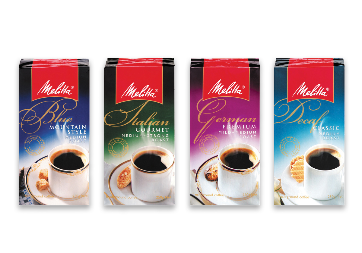
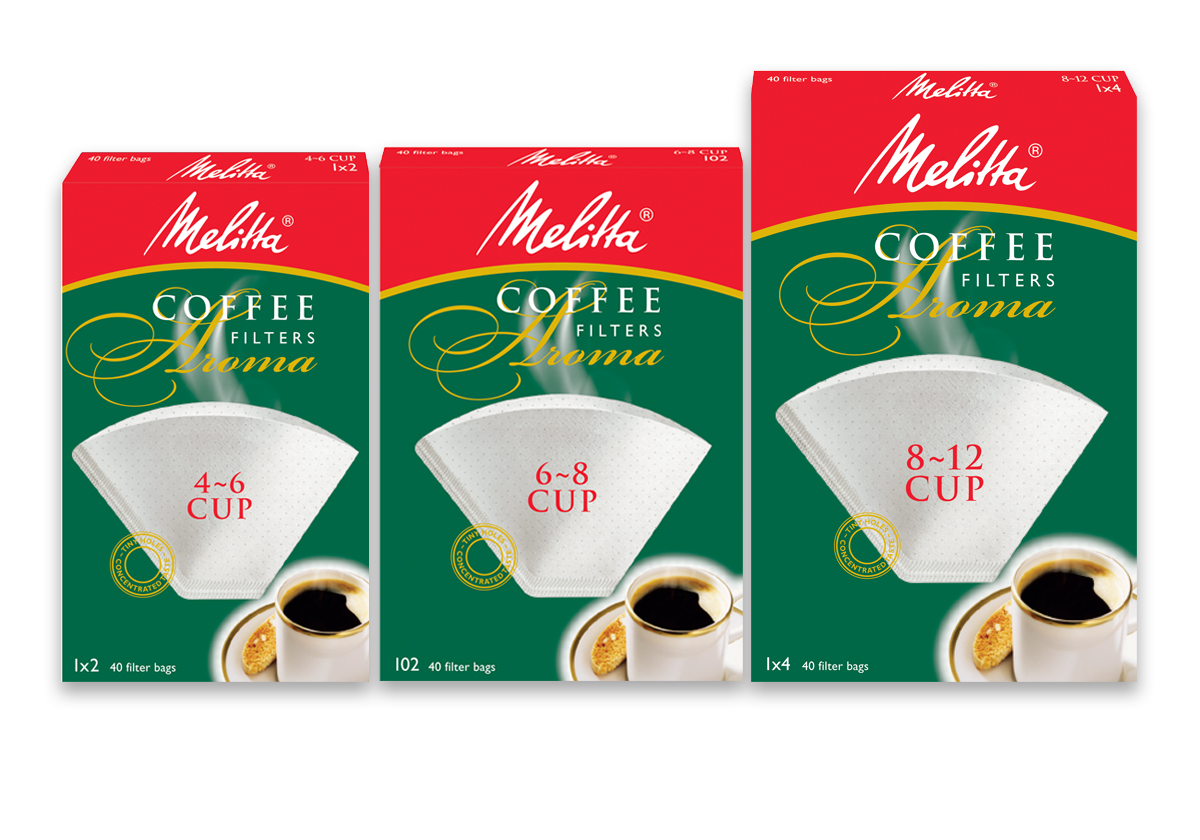
Despite strong recognition of Melitta, the brand was poorly defined in consumer’s minds and pack graphics were seen as a major barrier to consideration. Consumer research revealed the potential for Melitta to own a distinct and motivating new positioning defined as “me time”. Scarlet was employed to redesign the brand’s packs, bring to life this new positioning and entice current users to stay with the brand. New soft focus photography, a sensuous script hero typeface and a rich, earthy palette convey the indulgence of the coffee drinking occasion. The packs are printed on foil giving them a metallic finish instantly improving freshness and flavour credentials. A quality seal is used to further enhance quality and flavour perceptions. A simple to understand coffee strength indicator was implemented to aid consumer’s selection.
CLIENT
Lindt & Sprüngli
SERVICES
Packaging design
Art direction of photography
Range artwork