
Hunters Hill Orthodontics Brand Identity
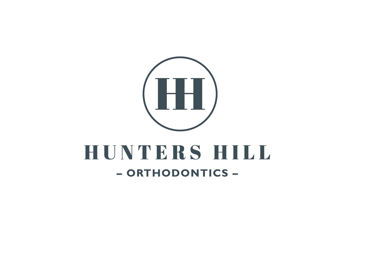
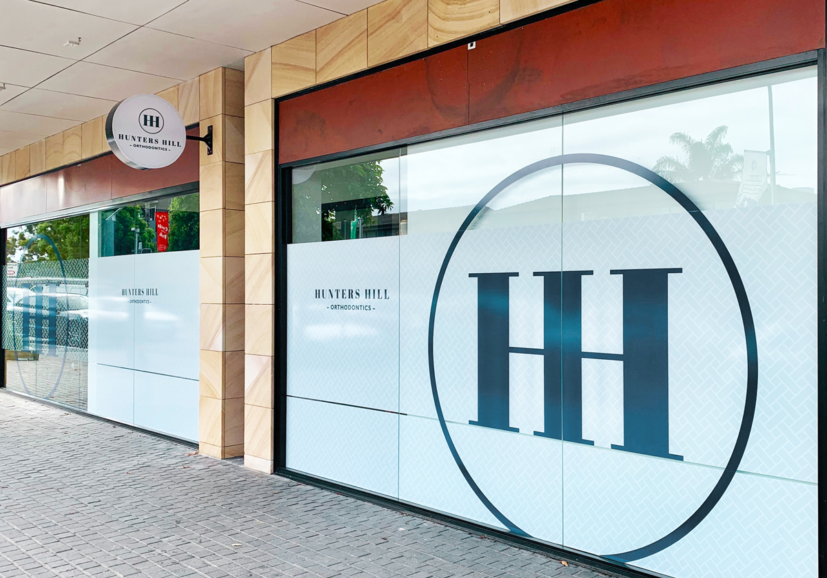
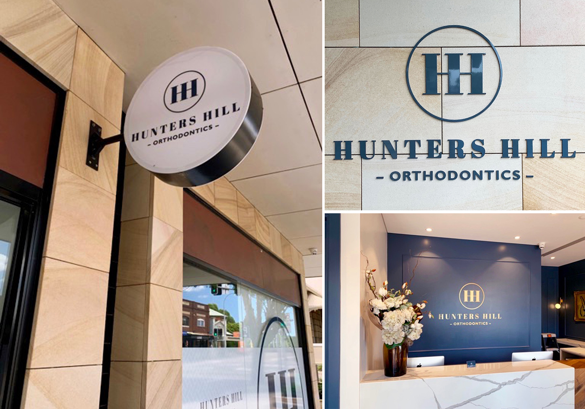
Our identity for new Hunters Hill Orthodontics reflects the heritage suburbs’s classic style as well as the premium, professional service the team provides. With its HHO logo, classic serif logotype and herringbone pattern, the new identity integrates seamlessly with the practice’s quarry blue, neo-classic interiors. Scarlet developed a range of educational materials, business stationery and interior and exterior signage for the practice.
CLIENT
Hunters Hill Orthodontics
SERVICES
Brand identity design
Business collateral design
Business collateral artwork
Signage design
Signage artwork
Signage production supervision